Wine Quality

We are working with a dataset of wines from Kaggle, which includes over 1500 wines with their chemical properties and a professionally determined quality between 3 and 8. One of the Kaggle challenges associated with this dataset was to predict the quality of the wine based on the chemical properties listed in the dataset. We decided to take up the challenge. Thus, our research question is:
How can we predict the quality of wine based on its chemical properties?
We read in the dataframe and take a look at the variables and their types. We see that this is a very clean dataset, without missing data and already in tidy format.
wine  <- read.csv(here::here('data/winequality-red.csv'))
skim(wine)| Name | wine |
| Number of rows | 1599 |
| Number of columns | 12 |
| _______________________ | |
| Column type frequency: | |
| numeric | 12 |
| ________________________ | |
| Group variables | None |
Variable type: numeric
| skim_variable | n_missing | complete_rate | mean | sd | p0 | p25 | p50 | p75 | p100 | hist |
|---|---|---|---|---|---|---|---|---|---|---|
| fixed.acidity | 0 | 1 | 8.32 | 1.74 | 4.60 | 7.10 | 7.90 | 9.20 | 15.90 | ▂▇▂▁▁ |
| volatile.acidity | 0 | 1 | 0.53 | 0.18 | 0.12 | 0.39 | 0.52 | 0.64 | 1.58 | ▅▇▂▁▁ |
| citric.acid | 0 | 1 | 0.27 | 0.19 | 0.00 | 0.09 | 0.26 | 0.42 | 1.00 | ▇▆▅▁▁ |
| residual.sugar | 0 | 1 | 2.54 | 1.41 | 0.90 | 1.90 | 2.20 | 2.60 | 15.50 | ▇▁▁▁▁ |
| chlorides | 0 | 1 | 0.09 | 0.05 | 0.01 | 0.07 | 0.08 | 0.09 | 0.61 | ▇▁▁▁▁ |
| free.sulfur.dioxide | 0 | 1 | 15.87 | 10.46 | 1.00 | 7.00 | 14.00 | 21.00 | 72.00 | ▇▅▁▁▁ |
| total.sulfur.dioxide | 0 | 1 | 46.47 | 32.90 | 6.00 | 22.00 | 38.00 | 62.00 | 289.00 | ▇▂▁▁▁ |
| density | 0 | 1 | 1.00 | 0.00 | 0.99 | 1.00 | 1.00 | 1.00 | 1.00 | ▁▃▇▂▁ |
| pH | 0 | 1 | 3.31 | 0.15 | 2.74 | 3.21 | 3.31 | 3.40 | 4.01 | ▁▅▇▂▁ |
| sulphates | 0 | 1 | 0.66 | 0.17 | 0.33 | 0.55 | 0.62 | 0.73 | 2.00 | ▇▅▁▁▁ |
| alcohol | 0 | 1 | 10.42 | 1.07 | 8.40 | 9.50 | 10.20 | 11.10 | 14.90 | ▇▇▃▁▁ |
| quality | 0 | 1 | 5.64 | 0.81 | 3.00 | 5.00 | 6.00 | 6.00 | 8.00 | ▁▇▇▂▁ |
While exploring the data, we found that for a lot of the variables, there didn’t seem to be a correlation between the chemical property and the quality of the wine. For the alcohol level and the volatile acidity of the wine, there did seem to be a correlation. We see lighter colors toward the top left of the plot, and darker colors in the bottom right. This does not fully answer our research question, but shows that these variables in part could explain the quality of the wine. For this visualisation, we have filtered out one outlier of the volatile acidity to ensure legibility of the plot.
# Creating a scatterplot from alcohol and volatile acidity

# Filter out one outlier with very high acidity
wine_plot <- filter(wine, volatile.acidity < 1.5)

# Plotting with quality as the color
ggplot(wine_plot , mapping = aes( y = `alcohol`, x = `volatile.acidity`, color = as.factor(quality))) +
  geom_point() +
  scale_color_viridis_d(name = 'Quality') +
  labs( # adding labels
    y = 'Alcohol (%)',
    x = 'Volatile Acidity',
    title = 'Effect of Alcohol and Volatile Acidity on Quality of Red Wine'
  ) +
  theme_minimal()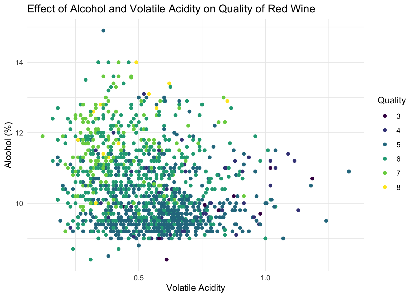
Now we are going to split our dataset in train (50%), validation (30%) and test (20%).
# create the splitting vector
# We selected the numbers based on the length of the dataset
split <- c(rep("Train", 800), rep("Valid", 480), rep("Test",  319))
wine <- wine  %>% mutate(split = sample(split))

# we create dataframes for each of the splits
wine_train <- wine %>% filter(split == "Train")
wine_valid <- wine %>% filter(split == "Valid")
wine_test  <- wine %>% filter(split == "Test")
Below, we see the distribution of the wine-quality over the different datasets. We see that the distributions are very similar across the different datasets, so this split is okay. Besides that, we see that the distribution is now equal across all categories. There are a lot more wines with qualities 5 and 6, so average wines, than there are really bad and really good wines. This will probably make it harder to predict the quality of the wines, as the data is imbalanced. Imbalanced data means that some datapoints should be considered more important than others, as there are only a few of the high and low quality wines. To be able to predict those high and low quality wines as well, we should have a different metric than mean squared error, as this counts errors in all catgories as equally important, while for us, it is much more significant if the high and low quality wines are not predicted well. Our new metric should take into account the frequency of that datapoint, so that we can overvalue mistakes in the 3 and 8 categories. Unfortunately, creating a metric like that was a bit out of the scope of this assignment, so we will be using the mean squared error, but we will also keep in mind that our results will probably not be optimal.
In the appendix, there is an attempt at using a different metric to evaluate the regression. This will try to value mistakes based on the frequency of the actual category the observation is in.
# creating a histogram showing the distribution over dataset
ggplot() +
  geom_bar(data = wine, mapping = aes(x = (quality) , fill = split), alpha = 0.7 )  +
  # getting pretty colours
  scale_fill_viridis_d(name = 'Dataset') +
  labs( # adding labels
    y = 'Count',
    x = 'Quality',
    title = 'Quality of wines in the datasets'
    ) +
  theme_minimal()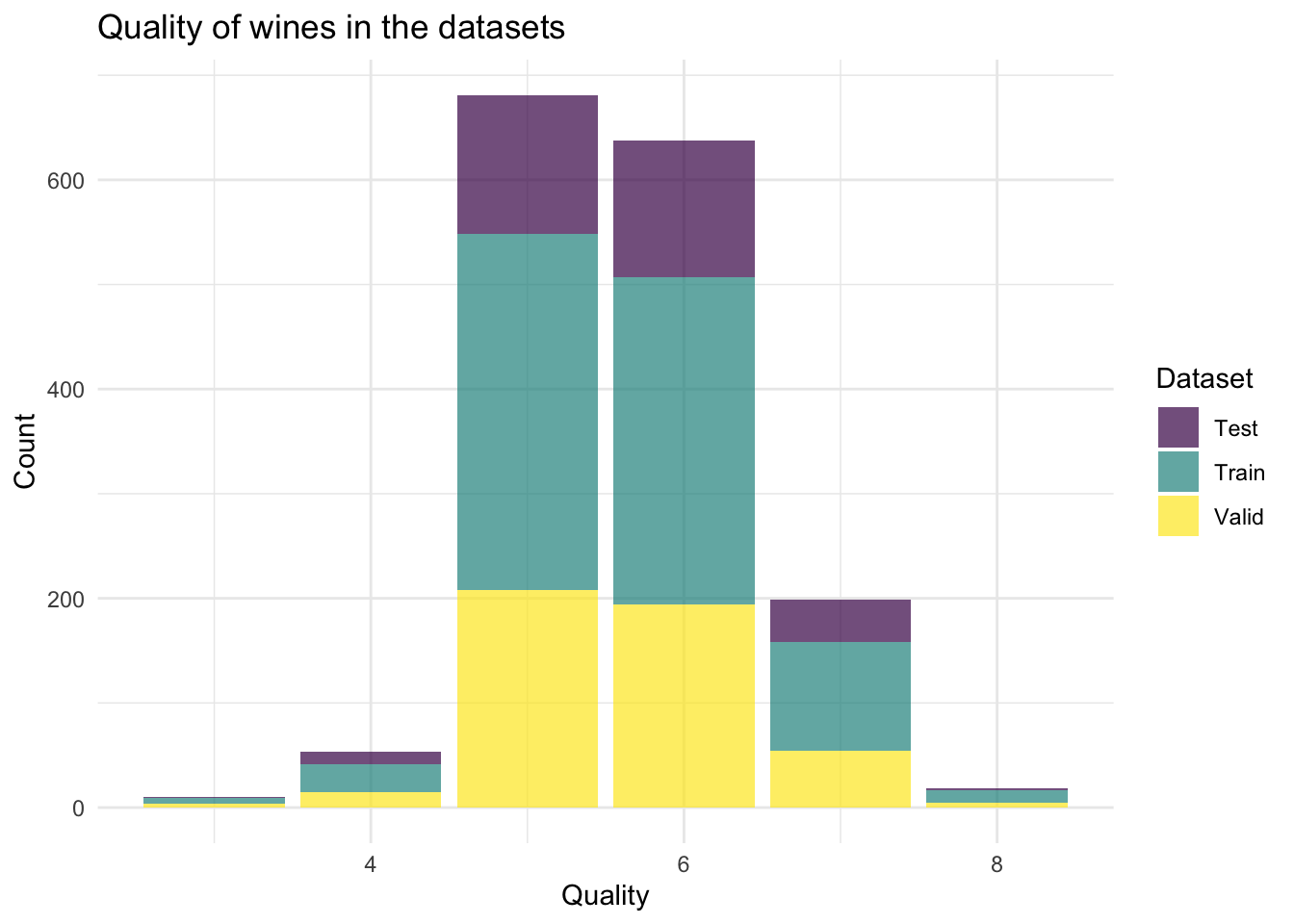
We have chosen to use a subset selection rather than regularisation methods, because we think thatlimiting the number of columns we use but still allowing for large values in those coefficients will be better than limiting all coefficients. Because, if all coefficients are small, they will likely tend to predict only average qualities rather than also the outliers. With the subset selection, we can cater to the outliers as well.
From here on, the best subset selection method will be implemented.
We write an mse function to get the mean squared error of a certain formula. Note that we have added an argument that has NULL as a default to be able to use this one interchangeably with the error function that takes the frequency into account.
lm_mse <- function(formula, train_data, valid_data, valid_with_freq = NULL) {
  y_name <- as.character(formula)[2]
  y_true <- valid_data[[y_name]]

  lm_fit <- lm(formula, train_data)
  y_pred <- predict(lm_fit, newdata = valid_data)

  mean((y_true - y_pred)^2)
}
We source the generate_formulas file written by the teacher from a class to be able to implement the subset selection method.
source("generate_formulas.R")We define the x and y variables to be able to apply the generate_formulas function
wine <- select(wine, -split) # removing the split column
x_vars <- colnames(wine)
x_vars <- x_vars[x_vars != "quality"] #using all variables except quality for the x
We get a vector of all functions.
formulas <- generate_formulas(p = 3, x_vars = x_vars, y_var = "quality")
len <- length(formulas)
We use a for loop to find the best set of 3 predictors in the wine dataset based on MSE. Use the wine_train and wine_valid datasets.
# Initialise a vector we will fill with MSE values
mses_3 <- rep(0, len)

# loop over all the formulas
for (i in 1:len) {
  mses_3[i] <- lm_mse(as.formula(formulas[i]), wine_train, wine_valid)
}

# select the formula with the lowest MSE
best_3_preds <- formulas[which.min(mses_3)]
best_3_preds
## [1] "quality ~ volatile.acidity + total.sulfur.dioxide + alcohol"We now use that knowledge to create a for-loop over all the numbers of parameters we want to consider and wrap it all in a function. Here we make the function that calculates the error, in this case lm_mse, a parameter to be able to change that in the appendix.
# We find the best formula

find_best_formula <- function(error_function, train_data, valid_data, valid_with_freq = NULL){

  # Initialise formula lists to be able to access the formulas later
  formula_list <- list()
  # initialise smallest error
  overall_min <- 100000000

  for (i in 1:4){
    formulas <- generate_formulas(p = i, x_vars = x_vars, y_var = "quality")
    formula_list <- c(formula_list, list(formulas))

    # Initialise a vector we will fill with MSE values
    errors <- rep(0, length(formulas))

    for (j in 1:length(formulas)) {
    errors[j] <- error_function(as.formula(formulas[i]), train_data, valid_data, valid_with_freq)
    }

    localmin <- min(errors)

    if (localmin <= overall_min){
      overall_min <- localmin
      nr_param <- i
      min_formula <- formulas[which.min(errors)]
    }
  }

  min_formula

}
Applying the formula
best_formula <- find_best_formula(lm_mse, wine_train, wine_valid)We have now found the model with the lowest mean squared error, which we will use to get the optimal model.
# Estimate model and calculate mse
lm_best <- lm(best_formula, data = wine_train)
mse <- function(y_true, y_pred) mean((y_true - y_pred)^2)
mse(wine_test$quality, predict(lm_best, newdata = wine_test))
## [1] 0.5025736Finally, we plot the result of our regression model. The green line represents where the data would be in a case of a perfect prediction. We see that in general, our values are closer to the middle than they should be. This is probably due to the earlier mentioned imbalanced data. The regression fit is now optimalised for the average wines and does not do well for the exceptionally bad or exceptionally good wines, which makes sense due to the few observations we have in that range. Overall, our mean squared error is not that big, but the regression seems skewed still. We could improve this with a different evaluation method like mentioned above or even a sampling method where we pick fewer of the average wines to train our model on. Unfortunately, all of those methods are outside the scope of this assignment.
# create a simple scatterplot plot
create_evaluation_plot <- function(model){
  tibble(
    y_true_plt = wine_test$quality,
    y_pred_plt = predict(model, newdata = wine_test)
  ) %>%
    ggplot(aes(x = y_pred_plt, y = factor(y_true_plt))) +
    # note that the intercept here is based on the number of categories
    # So like this it creates the line y = x for reference
    geom_abline(slope = 1, intercept = -2, lty = 2, col = 'darkgreen' ) +
    # we plot the datapoints as a violin to show the distribution
    geom_violin(orientation = 'y', alpha = 0.6) +
    labs( # add labels
      y = 'True quality',
      x = 'Predicted quality',
      title = 'Evaluation of predictions',
      color = 'Fit'
      ) +
    theme_minimal()
}create_evaluation_plot(lm_best)## Warning: Groups with fewer than two data points have been dropped.
## Groups with fewer than two data points have been dropped.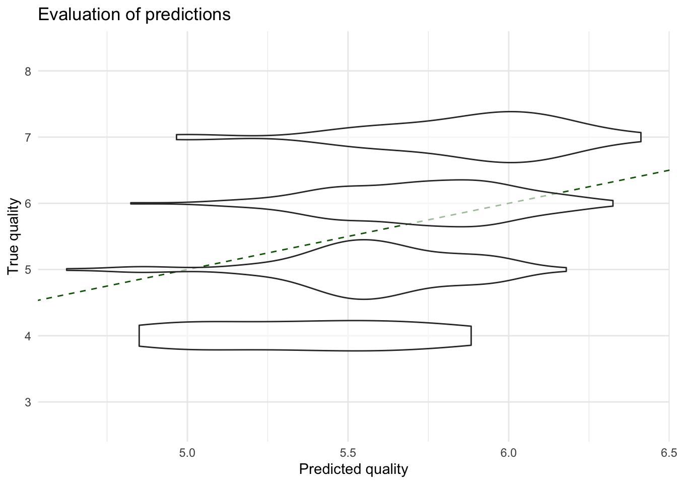
summary(lm_best)##
## Call:
## lm(formula = best_formula, data = wine_train)
##
## Residuals:
## Min 1Q Median 3Q Max
## -2.58905 -0.57077 -0.00538 0.46400 2.97688
##
## Coefficients:
## Estimate Std. Error t value Pr(>|t|)
## (Intercept) 6.369954 0.178676 35.651 <2e-16 ***
## fixed.acidity 0.032992 0.022023 1.498 0.135
## volatile.acidity -1.800172 0.185559 -9.701 <2e-16 ***
## citric.acid -0.201637 0.220180 -0.916 0.360
## residual.sugar 0.006171 0.018964 0.325 0.745
## ---
## Signif. codes: 0 '***' 0.001 '**' 0.01 '*' 0.05 '.' 0.1 ' ' 1
##
## Residual standard error: 0.765 on 795 degrees of freedom
## Multiple R-squared: 0.1443, Adjusted R-squared: 0.14
## F-statistic: 33.51 on 4 and 795 DF, p-value: < 2.2e-16In conclusion, the quality of the wine can be predicted to some extent by the volatile acidity, chlorides, sulphates and alcohol level in the wine. We see that lower acidity means a higher quality, while higher sulphate and alcohol levels are also indicators of a higher quality wine. Chlorides actually don’t significantly predict the quality, but did lower the mean squared error, which is why it’s still included. So, next time you’re standing in the supermarket looking for a good but cheap wine, taking the alcohol level as an indicator is actually a good idea!
Appendix A: Different error function
In order to account for the skewed data we have and hopefully be better able to predict whether a wine is really good or really bad, we have implemented a slightly different error function here. First we define a frequency column in the validation dataset.
freq <- as.data.frame(table(wine_valid$quality) / length(wine_valid$quality ))
names(freq) <- c('quality', 'freq')
wine_valid_incl_freq <- merge(wine_valid, freq, by = 'quality', all.x = TRUE) %>%
  mutate(freq = 1 - freq)
We then use this column to add a ‘weight’ to the errors of each datapoint. The inverted frequency is used to give more weight to the qualities that have a lower frequency. The goal is to make the chosen function more accurate for higher and lower quality wines.
weighted_error <- function(formula, train_data, valid_data, valid_with_freq) {
  # this code is the same as before
  y_name <- 'quality'
  y_true <- valid_data[[y_name]]


  lm_fit <- lm(best_formula, train_data)
  y_pred <- predict(lm_fit, newdata = valid_data)

  # we create an inverted frquency vector
  freq_vector <- valid_with_freq[['freq']]

  # Then, we use roughly the same error function
  mean((freq_vector*(y_true - y_pred))^2)
}
Below we see that exactly the same formula came from this error function. From this we can conclude that the chosen formula already classifies high and low quality wines correctly.
new_best_formula <- find_best_formula(weighted_error, wine_train, wine_valid, wine_valid_incl_freq)
new_best <- lm(new_best_formula, data = wine_train)
mse(wine_test$quality, predict(new_best, newdata = wine_test))
## [1] 0.5025736print(new_best_formula)## [1] "quality ~ fixed.acidity + volatile.acidity + citric.acid + residual.sugar"print(best_formula)## [1] "quality ~ fixed.acidity + volatile.acidity + citric.acid + residual.sugar"Unfortunately, this way of accounting for the imbalanced data did not work. In the future we will have to choose a different way, for example over or undersampling the data. However, I could not find such a function for multi-category data. This could be something for a follow-up research question.
This entry was created based on a class assignment created in collaboration with Cedric Gevers (student nr 8051003), in June 2021.